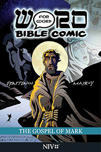
Onward we go to the next edition of Word for Word Bible Comic. This time it is the Gospel of Mark. Looking at the front cover, I don’t know if the text featured is Hebrew or Greek, but I’ve noticed they’ve been including ancient text on the Gospel editions. It is just another gorgeous cover.
Taking a quick look at the back side, they have an explicit rating system, which is something I’ve never seen on a comic book Bible of any type before, not even the manga ones. It is rated for 12 years or older, noting that it contains infrequent bloody violence and mild alcohol use, though they do make it known that there is no explicit nudity or sex. The illustration features a Roman soldier, making for a pretty cool back cover that teases what the book is about.
Concise Structure and Reused Panels
Of all the four gospels—Matthew, Mark, Luke, and John—I feel like Mark’s style of writing was straight and to the point. It is the shortest gospel, and he was very factual without being overly talkative in describing things. Because of that concise narrative style, it makes complete sense that this graphic novel volume is a little bit thinner than the others.
Looking inside, I noticed that the creators reused the exact same panel depicting John the Baptist baptizing Jesus that was featured in the Luke and Matthew volumes. If readers aren’t going to own all of the gospels or buy all four, it is just one panel, but I would have thought they would have made something different. I would have been completely okay with Matthew, Mark, Luke, and John all having different angles or different kinds of visuals for that event. It feels like a bit of a missed opportunity.
While some layouts look very similar, I am noticing different panels overall, which is exactly what I would expect since all four gospels give different accounts.
Panel Flow and Silent Storytelling
In terms of the layout structure, there is no strict rhyme or reason. The artists are not afraid to use angled panels, and they regularly feature full-page panels on the side. The physical pages are bigger on this edition, meaning they can comfortably hold ten panels on a single page if needed, but the arrangements never feel cramped. Even when a page contains quite a few panels, the layout feels pretty comfortable.
Another element I’ve noticed about these comic book Bibles is that there are quite a few panels featuring absolutely no dialogue whatsoever. On some pages, the majority of the panels contain no speech bubbles at all. While there is obviously narration running along the front, I actually quite like this silent panel style.
The narration text itself is very tiny and almost blends into the background, spanning only two to three lines. They clearly format it this way to ensure the script remains strictly word-for-word without a single term missing, but I would have been fine if it was a little bit more readable and noticeable. Some readers might just flip through the pages and completely miss it. It’s an interesting style choice they went with.
Narrative Drama and Artistic Consistency
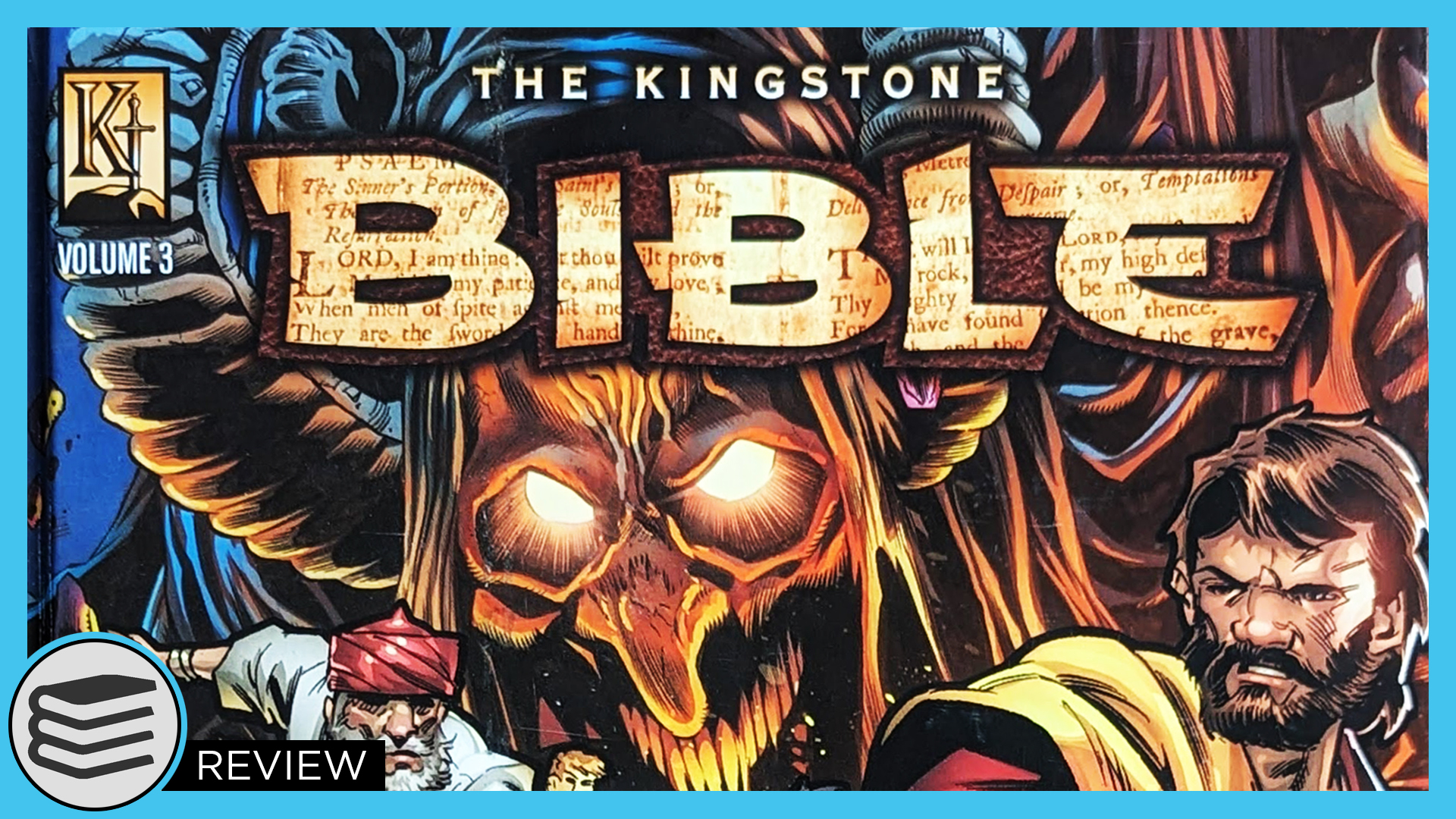
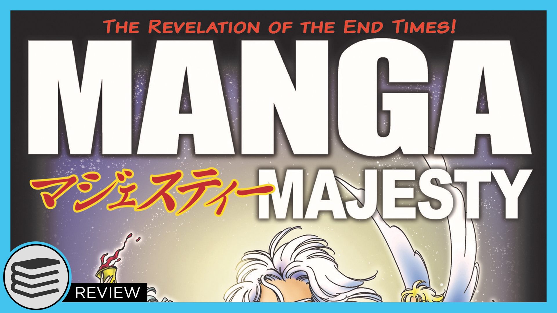
The comic beautifully renders dramatic biblical scenes, such as the disciples on the boat when Jesus commands the storm to be quiet and still. I really like this art style a lot; it is pretty cool. It is great to see different artistic interpretations across mediums, and I am genuinely enjoying all three major graphic styles out there, whether it’s the manga versions, the Kingstone Bible, or this series.
However, a slight advantage that this series has over the Kingstone version is that the art style remains perfectly consistent. In the large Kingstone volumes, you can clearly see the differences between sections because they utilized a rotating team of different artists. While it wasn’t a glaring problem, the perfect artistic consistency across these pages is a major benefit.
In terms of gore and violence, the book depicts the moment Herodias’s daughter demands John the Baptist’s head on a platter. Herod is clearly nervous about the request, but he honors it, and the panel shows John’s head brought out on a dish.
When tracking how they handle the scenes of Jesus being whipped and placed on the cross, the artists do reuse some of those historical panels from the previous books, which gives you a clear idea of what the violence is like. The layout also includes pure black pages featuring the series logo. These act as the visual equivalent of a paragraph break, signaling a change in chapters or scenes, which works very well.
Educational Back Matter and Final Value
The book concludes with Jesus resurrecting, leading directly into some cool historical extras at the back. It features an article titled “Designing Jesus” that explains the artistic choices behind how Jesus was drawn, alongside a section on harmonizing the events of the gospels. If you don’t get anything else out of these books, the back matter alone provides some really cool information.
This is another solid entry in the Word for Word Bible Comic line. It retails for about the same price as the Luke and Matthew volumes, offering another high-quality graphic resource, and I look forward to seeing more volumes on the way.